> ## Documentation Index
> Fetch the complete documentation index at: https://neo.tvk.company/llms.txt
> Use this file to discover all available pages before exploring further.
# Button
> A core interactive element, empowering users to take action effortlessly in your app.
## Examples
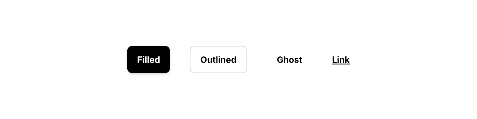
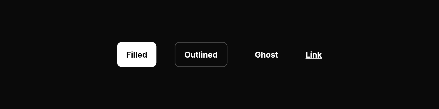 ```dart Primary lines theme={null}
NeoButton(
variant: .primary,
label: "Primary",
onPressed: () {},
),
```
```dart Secondary lines theme={null}
NeoButton(
variant: .secondary,
label: "Secondary",
onPressed: () {},
),
```
```dart Tertiary lines theme={null}
NeoButton(
variant: .tertiary,
label: "Tertiary",
onPressed: () {},
),
```
```dart Link lines theme={null}
NeoButton(
variant: .link,
label: "Link",
onPressed: () {},
),
```
```dart Primary lines theme={null}
NeoButton(
variant: .primary,
label: "Primary",
onPressed: () {},
),
```
```dart Secondary lines theme={null}
NeoButton(
variant: .secondary,
label: "Secondary",
onPressed: () {},
),
```
```dart Tertiary lines theme={null}
NeoButton(
variant: .tertiary,
label: "Tertiary",
onPressed: () {},
),
```
```dart Link lines theme={null}
NeoButton(
variant: .link,
label: "Link",
onPressed: () {},
),
```
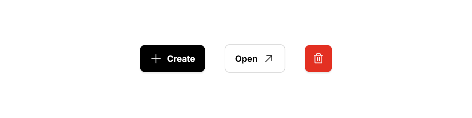
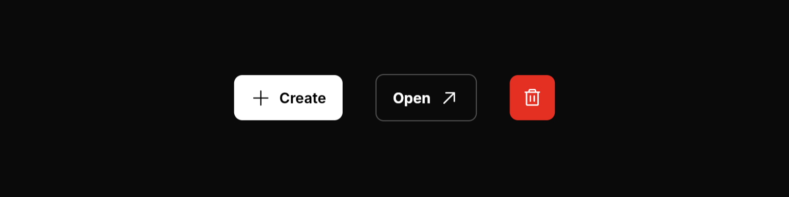 ```dart Leading Icon lines theme={null}
NeoButton(
variant: .primary,
label: "Create",
icon: PhosphorIconsRegular.plus,
onPressed: () {},
),
```
```dart Trailing Icon lines theme={null}
NeoButton(
variant: .secondary,
label: "Open",
icon: PhosphorIconsRegular.arrowUpRight,
iconPosition: .trailing,
onPressed: () {},
),
```
```dart Icon Only lines theme={null}
NeoButton(
variant: .primary,
icon: PhosphorIconsRegular.trash,
isDanger: true,
onPressed: () {},
),
```
```dart Leading Icon lines theme={null}
NeoButton(
variant: .primary,
label: "Create",
icon: PhosphorIconsRegular.plus,
onPressed: () {},
),
```
```dart Trailing Icon lines theme={null}
NeoButton(
variant: .secondary,
label: "Open",
icon: PhosphorIconsRegular.arrowUpRight,
iconPosition: .trailing,
onPressed: () {},
),
```
```dart Icon Only lines theme={null}
NeoButton(
variant: .primary,
icon: PhosphorIconsRegular.trash,
isDanger: true,
onPressed: () {},
),
```
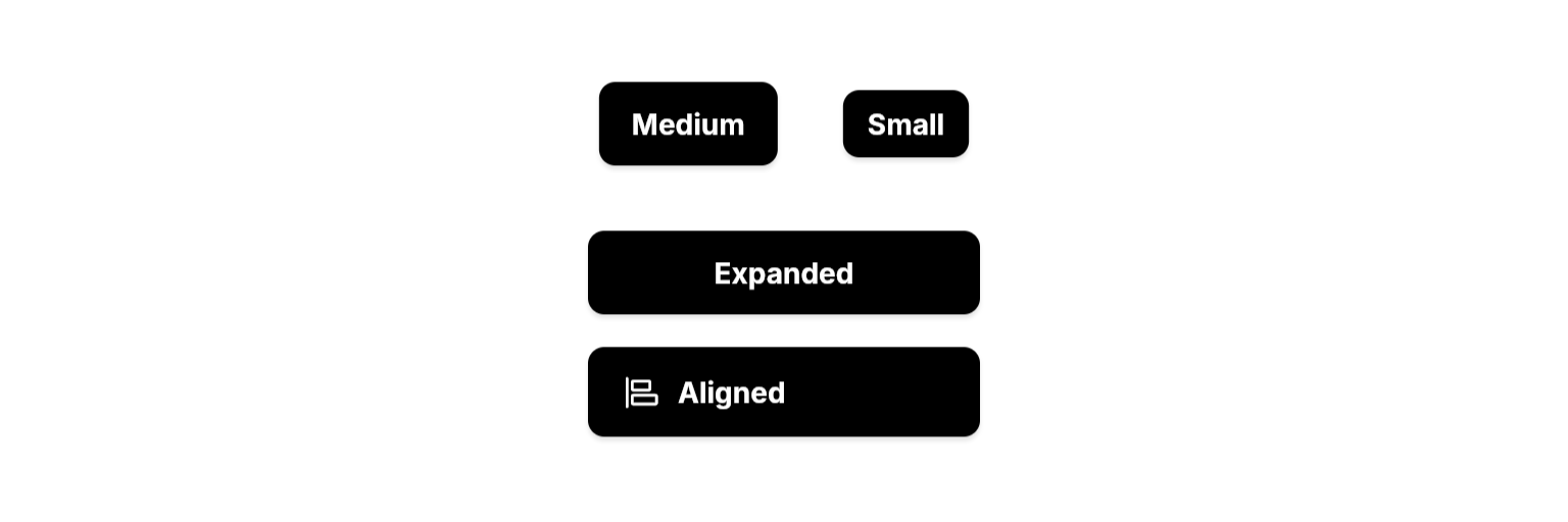
 ```dart Medium lines theme={null}
NeoButton(
variant: .primary,
size: .medium,
label: "Medium",
onPressed: () {},
),
```
```dart Small lines theme={null}
NeoButton(
variant: .primary,
size: .small,
label: "Small",
onPressed: () {},
),
```
```dart Expanded lines theme={null}
NeoButton(
variant: .primary,
isExpanded: true,
label: "Expanded",
onPressed: () {},
),
```
```dart Aligned Left lines theme={null}
NeoButton(
variant: .primary,
isExpanded: true,
alignment: .start,
label: "Aligned",
icon: PhosphorIconsRegular.alignLeft,
onPressed: () {},
),
```
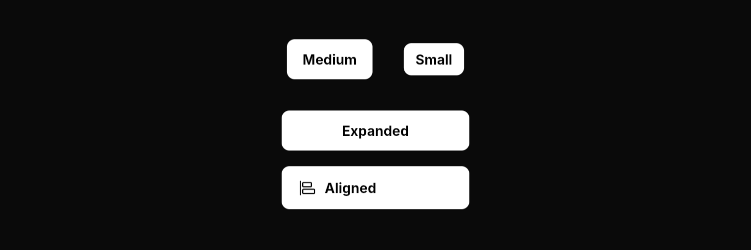
```dart Medium lines theme={null}
NeoButton(
variant: .primary,
size: .medium,
label: "Medium",
onPressed: () {},
),
```
```dart Small lines theme={null}
NeoButton(
variant: .primary,
size: .small,
label: "Small",
onPressed: () {},
),
```
```dart Expanded lines theme={null}
NeoButton(
variant: .primary,
isExpanded: true,
label: "Expanded",
onPressed: () {},
),
```
```dart Aligned Left lines theme={null}
NeoButton(
variant: .primary,
isExpanded: true,
alignment: .start,
label: "Aligned",
icon: PhosphorIconsRegular.alignLeft,
onPressed: () {},
),
```
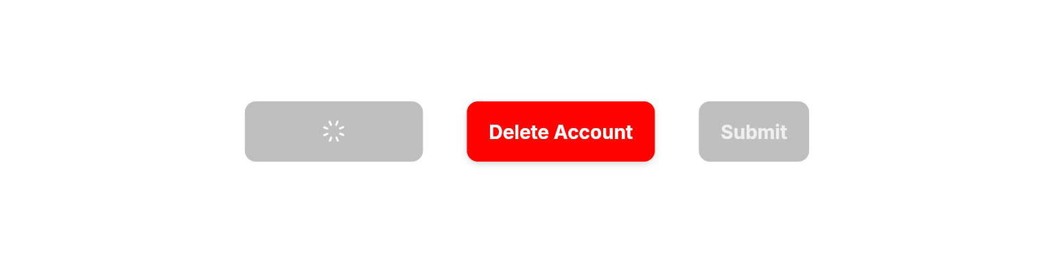
 ```dart Loading State lines theme={null}
NeoButton(
variant: .primary,
label: "Save Changes",
isLoading: true,
onPressed: () {},
),
```
```dart Danger State lines theme={null}
NeoButton(
variant: .primary,
label: "Delete Account",
isDanger: true,
onPressed: () {},
),
```
```dart Disabled State lines theme={null}
NeoButton(
variant: .filled,
label: "Submit",
isEnabled: false,
onPressed: () {},
),
```
## Properties
### Required
The variant/style of the button.
The callback to call when the button is pressed.
### Content
The text label to display on the button.
The icon to display on the button. (e.g. `PhosphorIconsRegular.plus`)
The position of the icon. Only applies when `icon` is provided.
The tooltip text to display when hovering over the button.
Adds a caret icon to the button and rotates it based on this boolean value. Useful for dropdown toggles.
### Layout
The size of the button.
Whether the button should fill the available width.
The alignment of the content inside the button. Only applies when `isExpanded` is `true`.
### State
Shows a spinning indicator and disables interaction. Useful for async operations.
Applies danger styling (typically red colors) to indicate destructive actions like deletion.
Controls whether the button responds to user interaction. Disabled buttons have reduced opacity and show a forbidden cursor.
When enabled, users must hold the button for a specified duration before the action is triggered. Only supported for `NeoButtonVariant.secondary` buttons.
The duration users must hold the button when `requireHold` is `true`.
### Styling
The background color of the button. Only valid on the `primary` variant — use `fgColor` and `fgInteractionColor` for other variants.
The background color for both hover and pressed states. Overrides the theme-derived interaction color.
The foreground color of all content inside the button (label, icon, caret). Essential when using custom background colors.
The foreground color for both hover and pressed states.
## Enums
### NeoButtonVariant
Different variants/styles of buttons.
* `primary`: Solid fill for high emphasis.
* `secondary`: Border-only for medium emphasis.
* `tertiary`: No fill or border initially; fills on hover for low emphasis.
* `link`: Underlined text style for low-emphasis actions and navigation.
### NeoButtonSize
* `small`: Compact size for dense UIs.
* `medium`: Standard size for most cases.
### NeoButtonAlignment
* `start`: Aligns content to the left.
* `center`: Default centering.
### NeoButtonIconPosition
* `leading`: Icon before label.
* `trailing`: Icon after label.
## Best Practices
* **Width Constraints**: When using `isExpanded: true`, always provide width constraints to prevent layout issues by wrapping in `Expanded`, `ConstrainedBox`, `SizedBox`, etc.
* **Loading States**: Use `isLoading: true` for async operations to provide visual feedback and prevent double-taps
* **Danger Actions**: Always use `isDanger: true` for destructive actions like deletion or data loss
* Combine with [`NeoHaptics`](/utilities/haptics) in the `onPressed` callback for enhanced user experience on supported devices
* Limit the number of primary (filled) buttons per screen to avoid decision paralysis
* `tooltip` is essential for accessibility when using icon-only buttons, and helpful for providing additional context on any button
* Edge case: If no `label` or `icon` is provided, the button renders as empty—always provide at least one
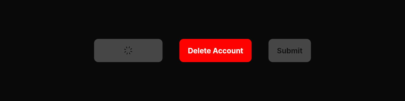
```dart Loading State lines theme={null}
NeoButton(
variant: .primary,
label: "Save Changes",
isLoading: true,
onPressed: () {},
),
```
```dart Danger State lines theme={null}
NeoButton(
variant: .primary,
label: "Delete Account",
isDanger: true,
onPressed: () {},
),
```
```dart Disabled State lines theme={null}
NeoButton(
variant: .filled,
label: "Submit",
isEnabled: false,
onPressed: () {},
),
```
## Properties
### Required
The variant/style of the button.
The callback to call when the button is pressed.
### Content
The text label to display on the button.
The icon to display on the button. (e.g. `PhosphorIconsRegular.plus`)
The position of the icon. Only applies when `icon` is provided.
The tooltip text to display when hovering over the button.
Adds a caret icon to the button and rotates it based on this boolean value. Useful for dropdown toggles.
### Layout
The size of the button.
Whether the button should fill the available width.
The alignment of the content inside the button. Only applies when `isExpanded` is `true`.
### State
Shows a spinning indicator and disables interaction. Useful for async operations.
Applies danger styling (typically red colors) to indicate destructive actions like deletion.
Controls whether the button responds to user interaction. Disabled buttons have reduced opacity and show a forbidden cursor.
When enabled, users must hold the button for a specified duration before the action is triggered. Only supported for `NeoButtonVariant.secondary` buttons.
The duration users must hold the button when `requireHold` is `true`.
### Styling
The background color of the button. Only valid on the `primary` variant — use `fgColor` and `fgInteractionColor` for other variants.
The background color for both hover and pressed states. Overrides the theme-derived interaction color.
The foreground color of all content inside the button (label, icon, caret). Essential when using custom background colors.
The foreground color for both hover and pressed states.
## Enums
### NeoButtonVariant
Different variants/styles of buttons.
* `primary`: Solid fill for high emphasis.
* `secondary`: Border-only for medium emphasis.
* `tertiary`: No fill or border initially; fills on hover for low emphasis.
* `link`: Underlined text style for low-emphasis actions and navigation.
### NeoButtonSize
* `small`: Compact size for dense UIs.
* `medium`: Standard size for most cases.
### NeoButtonAlignment
* `start`: Aligns content to the left.
* `center`: Default centering.
### NeoButtonIconPosition
* `leading`: Icon before label.
* `trailing`: Icon after label.
## Best Practices
* **Width Constraints**: When using `isExpanded: true`, always provide width constraints to prevent layout issues by wrapping in `Expanded`, `ConstrainedBox`, `SizedBox`, etc.
* **Loading States**: Use `isLoading: true` for async operations to provide visual feedback and prevent double-taps
* **Danger Actions**: Always use `isDanger: true` for destructive actions like deletion or data loss
* Combine with [`NeoHaptics`](/utilities/haptics) in the `onPressed` callback for enhanced user experience on supported devices
* Limit the number of primary (filled) buttons per screen to avoid decision paralysis
* `tooltip` is essential for accessibility when using icon-only buttons, and helpful for providing additional context on any button
* Edge case: If no `label` or `icon` is provided, the button renders as empty—always provide at least one