> ## Documentation Index
> Fetch the complete documentation index at: https://neo.tvk.company/llms.txt
> Use this file to discover all available pages before exploring further.
# Text Field
> A versatile input field for capturing user text input with support for icons, labels, validation, and various input types.
## Examples
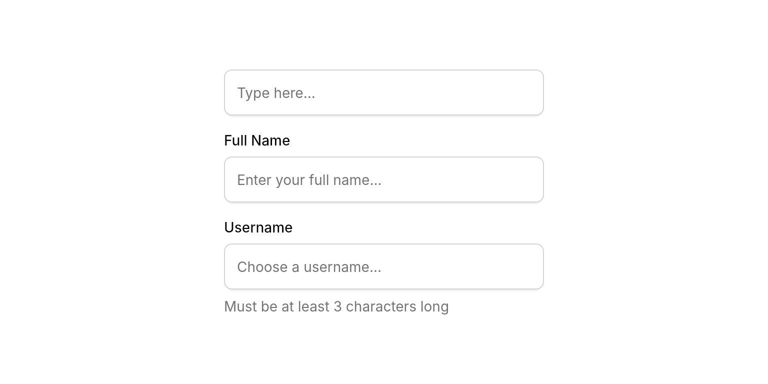
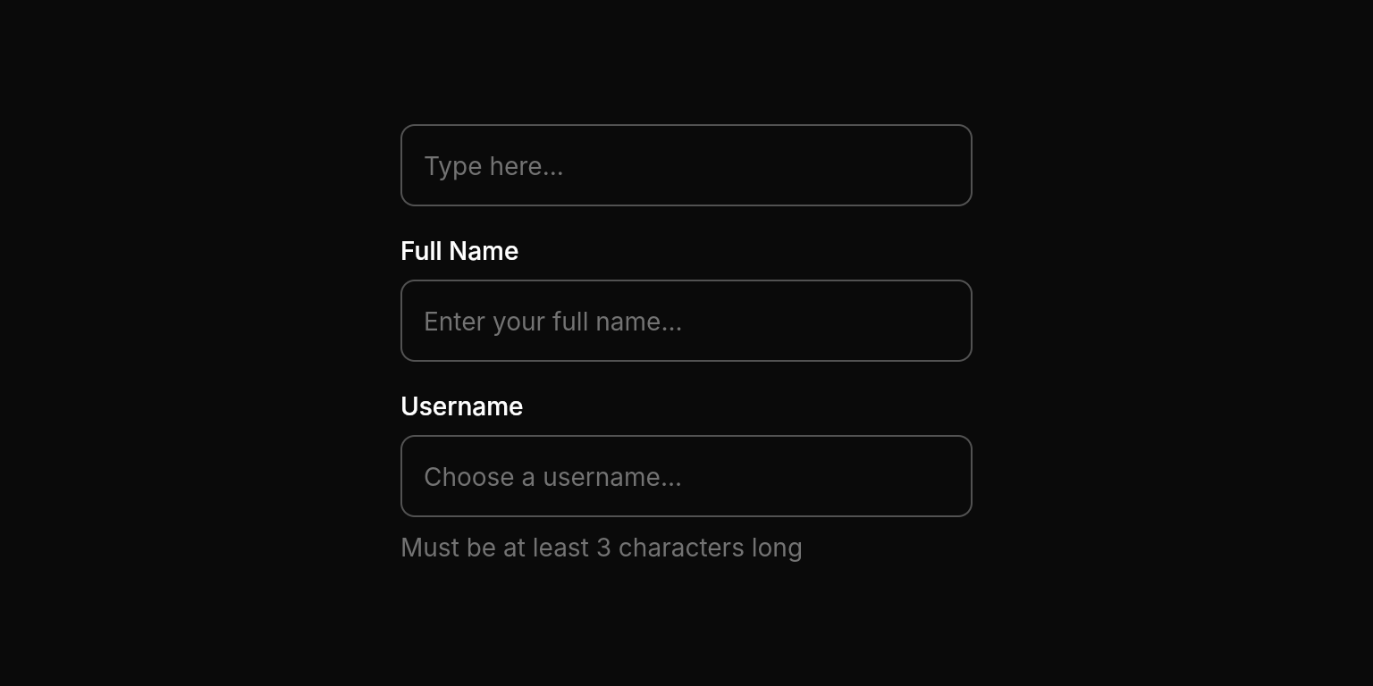 ```dart Simple Text Field lines theme={null}
NeoTextField(
controller: controller, // Using e.g. useTextEditingController() hook
onChanged: (value) {
// Handle input
},
),
```
```dart With Label lines theme={null}
NeoTextField(
controller: controller, // Using e.g. useTextEditingController() hook
label: "Full Name",
placeholder: "Enter your full name",
onChanged: (value) {
// Handle input
},
),
```
```dart With Description lines theme={null}
NeoTextField(
controller: controller, // Using e.g. useTextEditingController() hook
label: "Username",
placeholder: "Choose a username",
description: "Must be at least 3 characters long",
onChanged: (value) {
// Handle input
},
),
```
```dart Simple Text Field lines theme={null}
NeoTextField(
controller: controller, // Using e.g. useTextEditingController() hook
onChanged: (value) {
// Handle input
},
),
```
```dart With Label lines theme={null}
NeoTextField(
controller: controller, // Using e.g. useTextEditingController() hook
label: "Full Name",
placeholder: "Enter your full name",
onChanged: (value) {
// Handle input
},
),
```
```dart With Description lines theme={null}
NeoTextField(
controller: controller, // Using e.g. useTextEditingController() hook
label: "Username",
placeholder: "Choose a username",
description: "Must be at least 3 characters long",
onChanged: (value) {
// Handle input
},
),
```
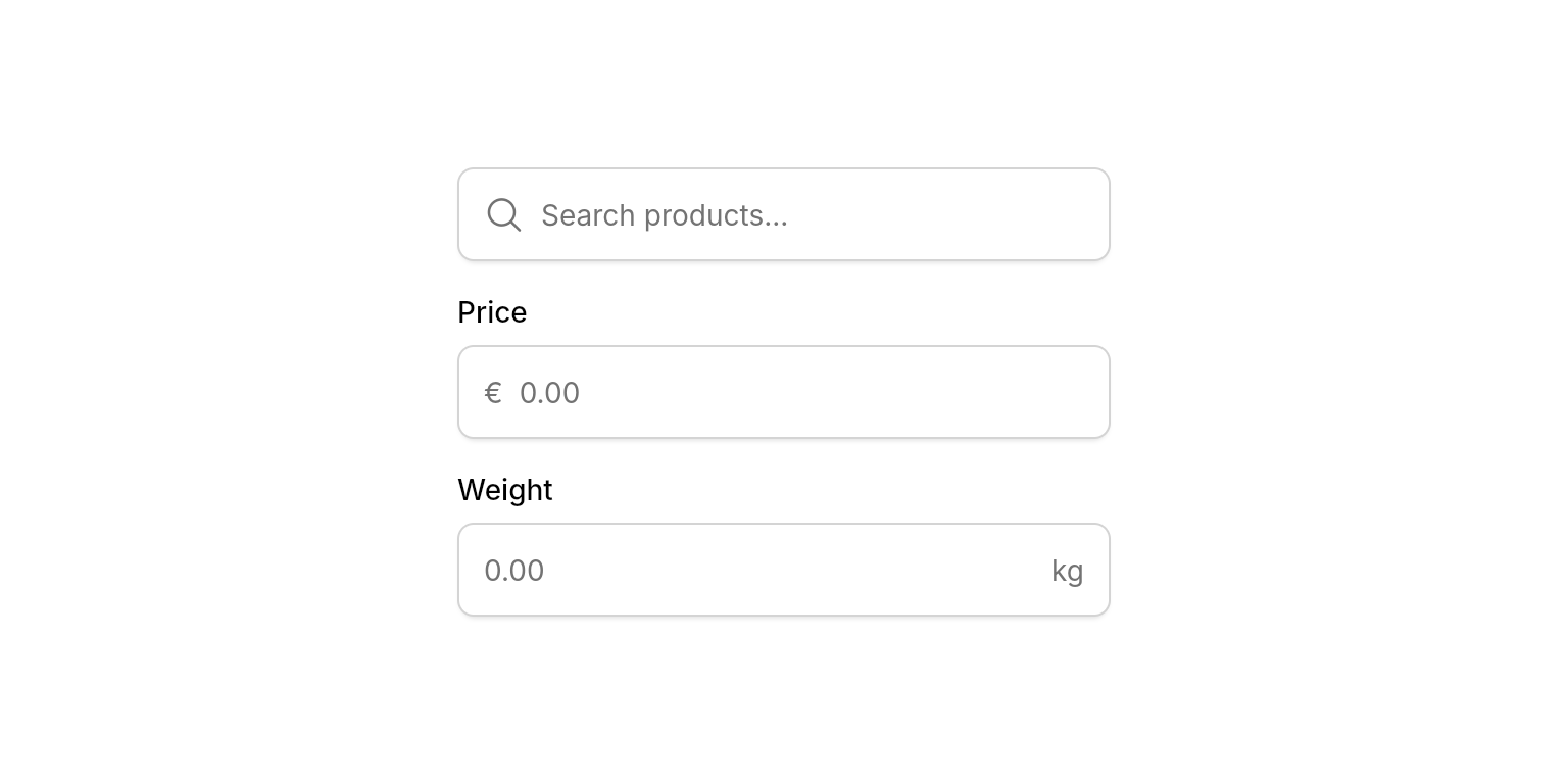
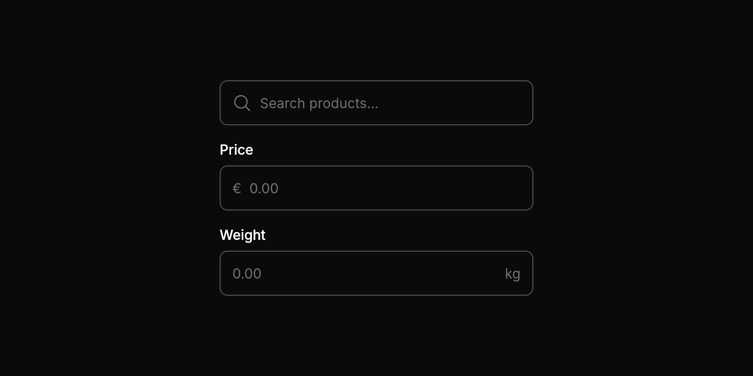 ```dart With Icon lines theme={null}
NeoTextField(
controller: controller, // Using e.g. useTextEditingController() hook
icon: PhosphorIconsRegular.magnifyingGlass,
placeholder: "Search products...",
onChanged: (value) {
// Handle input
},
),
```
```dart With Prefix lines theme={null}
NeoTextField(
controller: controller, // Using e.g. useTextEditingController() hook
label: "Price",
prefix: "€",
placeholder: "0.00",
keyboardType: .numberWithOptions(decimal: true),
onChanged: (value) {
// Handle input
},
),
```
```dart With Suffix lines theme={null}
NeoTextField(
controller: controller, // Using e.g. useTextEditingController() hook
label: "Weight",
suffix: "kg",
placeholder: "0.00",
keyboardType: .numberWithOptions(decimal: true),
onChanged: (value) {
// Handle input
},
),
```
```dart With Icon lines theme={null}
NeoTextField(
controller: controller, // Using e.g. useTextEditingController() hook
icon: PhosphorIconsRegular.magnifyingGlass,
placeholder: "Search products...",
onChanged: (value) {
// Handle input
},
),
```
```dart With Prefix lines theme={null}
NeoTextField(
controller: controller, // Using e.g. useTextEditingController() hook
label: "Price",
prefix: "€",
placeholder: "0.00",
keyboardType: .numberWithOptions(decimal: true),
onChanged: (value) {
// Handle input
},
),
```
```dart With Suffix lines theme={null}
NeoTextField(
controller: controller, // Using e.g. useTextEditingController() hook
label: "Weight",
suffix: "kg",
placeholder: "0.00",
keyboardType: .numberWithOptions(decimal: true),
onChanged: (value) {
// Handle input
},
),
```
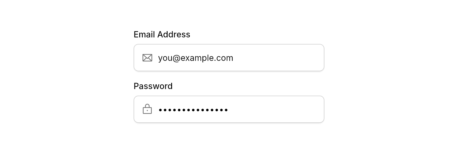
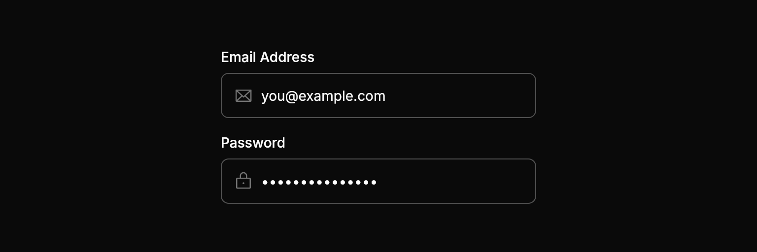 ```dart Email Input lines theme={null}
NeoTextField(
controller: controller, // Using e.g. useTextEditingController() hook
label: "Email Address",
icon: PhosphorIconsRegular.envelope,
keyboardType: .emailAddress,
autofillHints: [AutofillHints.email],
placeholder: "you@example.com",
onChanged: (value) {
// Handle input
},
),
```
```dart Password Input lines theme={null}
NeoTextField(
controller: controller, // Using e.g. useTextEditingController() hook
label: "Password",
icon: PhosphorIconsRegular.lock,
obscureText: true,
autofillHints: [AutofillHints.password],
placeholder: "Enter your password",
onChanged: (value) {
// Handle input
},
),
```
```dart Email Input lines theme={null}
NeoTextField(
controller: controller, // Using e.g. useTextEditingController() hook
label: "Email Address",
icon: PhosphorIconsRegular.envelope,
keyboardType: .emailAddress,
autofillHints: [AutofillHints.email],
placeholder: "you@example.com",
onChanged: (value) {
// Handle input
},
),
```
```dart Password Input lines theme={null}
NeoTextField(
controller: controller, // Using e.g. useTextEditingController() hook
label: "Password",
icon: PhosphorIconsRegular.lock,
obscureText: true,
autofillHints: [AutofillHints.password],
placeholder: "Enter your password",
onChanged: (value) {
// Handle input
},
),
```

 ```dart With Error lines theme={null}
NeoTextField(
controller: controller, // Using e.g. useTextEditingController() hook
label: "Email Address",
icon: PhosphorIconsRegular.envelope,
keyboardType: .emailAddress,
placeholder: "you@example.com",
errorText: "Please enter a valid email address",
onChanged: (value) {
// Handle input
},
),
```
## Properties
### Required
The controller for the text field that manages the text being edited.
### Content
The label text displayed above the text field.
The placeholder text shown when the field is empty.
Additional descriptive text displayed below the field. Useful for providing context or input requirements.
Text displayed at the beginning of the input area (e.g., "€", "https\://").
Text displayed at the end of the input area (e.g., ".com", "kg").
An optional icon displayed at the beginning of the field. Use `PhosphorIconsRegular.iconName`.
### Layout
Whether the text field should display a border. When false, creates a borderless input suitable for inline editing.
Whether the text field should have internal padding. When false, removes padding for custom layouts.
Whether to show a clear button (x) that allows users to quickly clear the text field content.
### Input Configuration
The type of keyboard to display for text input (e.g., `.emailAddress`, `.phone`).
Optional input formatters to restrict or modify input (e.g., length limits, character filters).
Hints for autofill services to provide appropriate suggestions (e.g., `[AutofillHints.email]`).
Whether to hide the text being entered. Typically used for password fields.
### State
Error message to display below the field. When provided, the field appears in an error state with red styling. To remove the error, set this to `null`.
Focus node for managing focus state programmatically. When not provided, the widget creates its own internal focus node.
Controls whether the text field is interactive. When `false`, the field dims, ignores input and focus, and shows a forbidden cursor.
### Callbacks
Callback function called whenever the text changes. Receives the current text value.
Callback function called when the user submits the text (e.g., pressing Enter). Receives the current text value.
Callback function called when the field loses focus. Useful for explicit blur event handling.
Whether to keep focus on the field after submission. Useful for forms where users might submit multiple times (e.g. a chat input).
## Best Practices
* **Width Constraints**: Always provide width constraints to prevent layout issues by wrapping in `ConstrainedBox`, `SizedBox`, `Expanded`, etc.
* **Input Types**: Always set appropriate `keyboardType` and `autofillHints` for better user experience on mobile devices.
* **Placeholders**: Use placeholder text to show examples or provide additional context about the expected input format.
## Integration Notes
* **Focus Management**: The text field automatically handles focus states and provides visual feedback when active.
```dart With Error lines theme={null}
NeoTextField(
controller: controller, // Using e.g. useTextEditingController() hook
label: "Email Address",
icon: PhosphorIconsRegular.envelope,
keyboardType: .emailAddress,
placeholder: "you@example.com",
errorText: "Please enter a valid email address",
onChanged: (value) {
// Handle input
},
),
```
## Properties
### Required
The controller for the text field that manages the text being edited.
### Content
The label text displayed above the text field.
The placeholder text shown when the field is empty.
Additional descriptive text displayed below the field. Useful for providing context or input requirements.
Text displayed at the beginning of the input area (e.g., "€", "https\://").
Text displayed at the end of the input area (e.g., ".com", "kg").
An optional icon displayed at the beginning of the field. Use `PhosphorIconsRegular.iconName`.
### Layout
Whether the text field should display a border. When false, creates a borderless input suitable for inline editing.
Whether the text field should have internal padding. When false, removes padding for custom layouts.
Whether to show a clear button (x) that allows users to quickly clear the text field content.
### Input Configuration
The type of keyboard to display for text input (e.g., `.emailAddress`, `.phone`).
Optional input formatters to restrict or modify input (e.g., length limits, character filters).
Hints for autofill services to provide appropriate suggestions (e.g., `[AutofillHints.email]`).
Whether to hide the text being entered. Typically used for password fields.
### State
Error message to display below the field. When provided, the field appears in an error state with red styling. To remove the error, set this to `null`.
Focus node for managing focus state programmatically. When not provided, the widget creates its own internal focus node.
Controls whether the text field is interactive. When `false`, the field dims, ignores input and focus, and shows a forbidden cursor.
### Callbacks
Callback function called whenever the text changes. Receives the current text value.
Callback function called when the user submits the text (e.g., pressing Enter). Receives the current text value.
Callback function called when the field loses focus. Useful for explicit blur event handling.
Whether to keep focus on the field after submission. Useful for forms where users might submit multiple times (e.g. a chat input).
## Best Practices
* **Width Constraints**: Always provide width constraints to prevent layout issues by wrapping in `ConstrainedBox`, `SizedBox`, `Expanded`, etc.
* **Input Types**: Always set appropriate `keyboardType` and `autofillHints` for better user experience on mobile devices.
* **Placeholders**: Use placeholder text to show examples or provide additional context about the expected input format.
## Integration Notes
* **Focus Management**: The text field automatically handles focus states and provides visual feedback when active.