> ## Documentation Index
> Fetch the complete documentation index at: https://neo.tvk.company/llms.txt
> Use this file to discover all available pages before exploring further.
# Modal
> A modal overlay for creating dialogs, confirmations, and custom popups with flexible content and actions.
**Different from other Neo widgets**: Modal is used as a method call (`NeoModal.show()`) rather than a widget you place in your build tree. Use it for important interactions that require user attention—confirmations, forms, or critical information that must be acknowledged.
## Examples
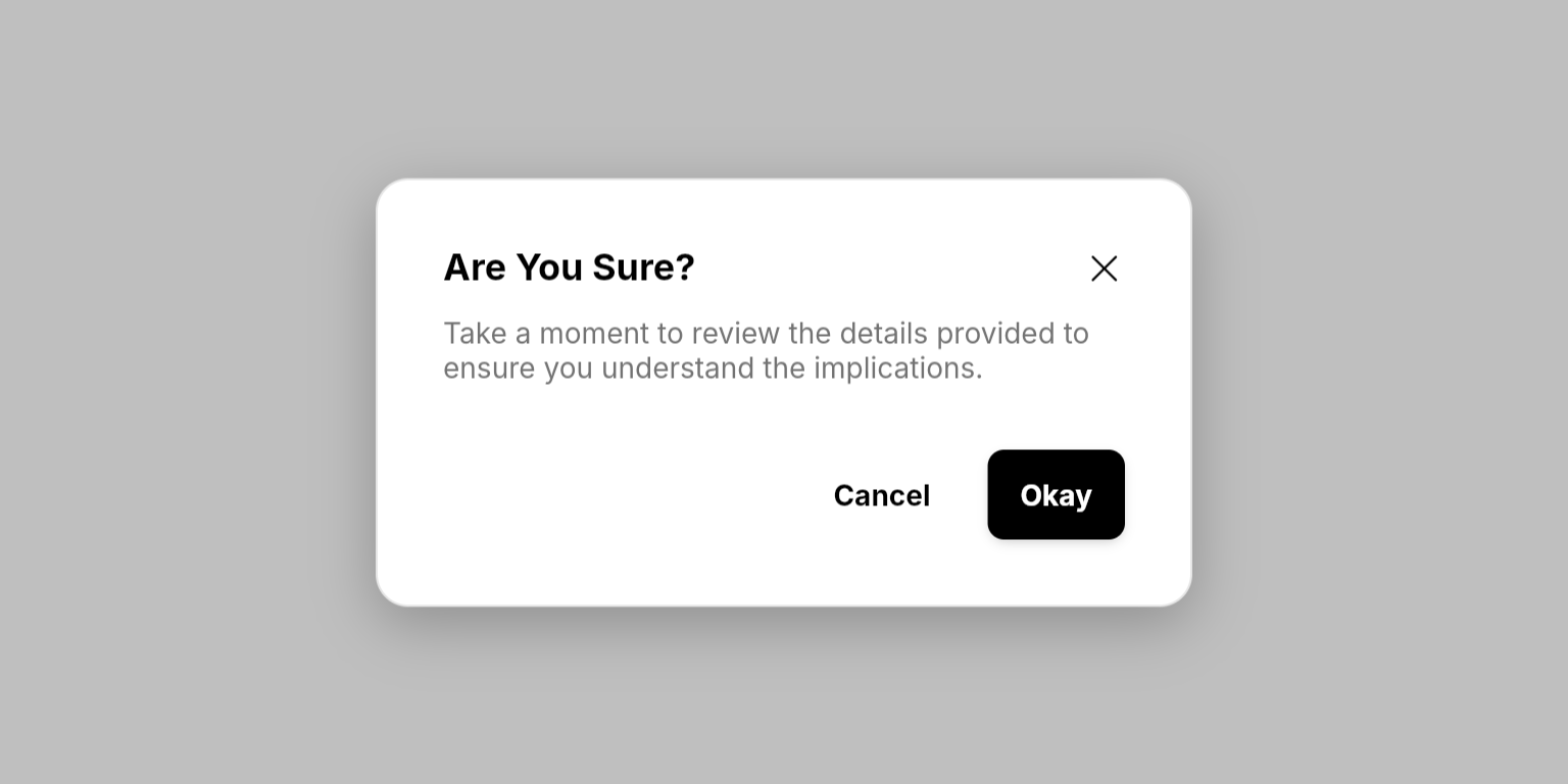
 ```dart Basic Modal lines theme={null}
NeoModal.show(
ref,
title: "Are You Sure?",
contentBuilder: (context) => Text(
"Take a moment to review the details provided to ensure you understand the implications.",
style: theme.textStyles.body2.copyWith(
color: theme.colors.fgSecondary,
),
),
actionsBuilder: (context) => [
NeoButton(
variant: .ghost,
label: "Cancel",
onPressed: () => NeoModal.dismissAll(ref),
),
NeoButton(
variant: .filled,
label: "Okay",
onPressed: () {
// Handle action
NeoModal.dismissAll(ref);
},
),
],
);
```
```dart Basic Modal lines theme={null}
NeoModal.show(
ref,
title: "Are You Sure?",
contentBuilder: (context) => Text(
"Take a moment to review the details provided to ensure you understand the implications.",
style: theme.textStyles.body2.copyWith(
color: theme.colors.fgSecondary,
),
),
actionsBuilder: (context) => [
NeoButton(
variant: .ghost,
label: "Cancel",
onPressed: () => NeoModal.dismissAll(ref),
),
NeoButton(
variant: .filled,
label: "Okay",
onPressed: () {
// Handle action
NeoModal.dismissAll(ref);
},
),
],
);
```

 ```dart Form Modal lines theme={null}
NeoModal.show(
ref,
isDismissable: false,
title: "Edit Profile",
contentBuilder: (context) => ValueListenableBuilder(
valueListenable: isChecked, // Using hooks
builder: (_, value, __) => Column(
crossAxisAlignment: .start,
mainAxisSize: .min,
children: [
Text(
"Make changes to your profile here. Click save when you're done.",
style: theme.textStyles.body2.copyWith(
color: theme.colors.fgSecondary,
),
),
Gap(theme.spacings.medium),
NeoTextField(
controller: nameController,
label: "Name",
),
Gap(theme.spacings.medium),
NeoTextField(
controller: emailController,
label: "Email",
),
Gap(theme.spacings.medium),
NeoCheckbox(
isChecked: value,
label: "I agree to the terms and conditions",
onChanged: (value) {
isChecked.value = value;
},
),
],
),
),
actionsBuilder: (context) => [
NeoButton(
variant: .ghost,
label: "Cancel",
onPressed: () => NeoModal.dismissAll(ref),
),
ValueListenableBuilder(
valueListenable: isChecked, // Using hooks
builder: (_, value, __) => NeoButton(
variant: .filled,
label: "Save Changes",
isEnabled: value,
onPressed: () {
// Handle save
NeoModal.dismissAll(ref);
},
),
),
],
);
```
```dart Form Modal lines theme={null}
NeoModal.show(
ref,
isDismissable: false,
title: "Edit Profile",
contentBuilder: (context) => ValueListenableBuilder(
valueListenable: isChecked, // Using hooks
builder: (_, value, __) => Column(
crossAxisAlignment: .start,
mainAxisSize: .min,
children: [
Text(
"Make changes to your profile here. Click save when you're done.",
style: theme.textStyles.body2.copyWith(
color: theme.colors.fgSecondary,
),
),
Gap(theme.spacings.medium),
NeoTextField(
controller: nameController,
label: "Name",
),
Gap(theme.spacings.medium),
NeoTextField(
controller: emailController,
label: "Email",
),
Gap(theme.spacings.medium),
NeoCheckbox(
isChecked: value,
label: "I agree to the terms and conditions",
onChanged: (value) {
isChecked.value = value;
},
),
],
),
),
actionsBuilder: (context) => [
NeoButton(
variant: .ghost,
label: "Cancel",
onPressed: () => NeoModal.dismissAll(ref),
),
ValueListenableBuilder(
valueListenable: isChecked, // Using hooks
builder: (_, value, __) => NeoButton(
variant: .filled,
label: "Save Changes",
isEnabled: value,
onPressed: () {
// Handle save
NeoModal.dismissAll(ref);
},
),
),
],
);
```

 ```dart Non-Dismissable Modal lines theme={null}
NeoModal.show(
ref,
title: "Delete Product?",
isDismissable: false,
contentBuilder: (context) => Text(
"You're about to delete this product. This action cannot be reversed.",
style: theme.textStyles.body2.copyWith(
color: theme.colors.fgSecondary,
),
),
actionsBuilder: (context) => [
ValueListenableBuilder(
valueListenable: isDeleteProductLoading, // Using hooks
builder: (_, value, __) {
return NeoButton(
variant: .ghost,
isEnabled: !value,
label: "Cancel",
onPressed: () => NeoModal.dismissAll(ref),
);
}),
ValueListenableBuilder(
valueListenable: isDeleteProductLoading, // Using hooks
builder: (_, value, __) => NeoButton(
variant: .filled,
label: "Delete Product",
icon: PhosphorIconsRegular.trash,
isDanger: true,
isLoading: value,
onPressed: () async {
isDeleteProductLoading.value = true;
// Handle delete
NeoModal.dismissAll(ref);
isDeleteProductLoading.value = false;
},
),
),
],
);
```
## Methods
### NeoModal.show()
Displays a modal overlay with customizable content and actions.
#### Required Parameters
The widget reference from a `ConsumerWidget` or `HookConsumerWidget`, used to access the modal provider.
The title text displayed at the top of the modal.
A builder function that returns the main content of the modal. Use this to create forms, display information, or any custom content.
A builder function that returns a list of action buttons displayed at the bottom of the modal. Typically contains confirm/cancel buttons.
#### Optional Parameters
Whether users can dismiss the modal by clicking the background or close button. Set to `false` for critical modals that require explicit user action.
The size of the modal. Controls the maximum width.
### NeoModal.dismissAll()
Dismisses all currently visible modals.
The widget reference to access the modal provider.
### NeoModal.dismissCount()
Dismisses a specific number of modals from the top of the stack.
The widget reference to access the modal provider.
The number of modals to dismiss from the stack.
## Enums
### NeoModalSize
Controls the maximum width of the modal.
* `small` (400px): Best for most use cases, simple confirmations and brief messages.
* `medium` (640px): Ideal for forms and moderate content.
* `large` (896px): Perfect for extensive content, detailed forms, or comprehensive information.
* `extraLarge` (1536px): For wide content like tables, dashboards, or side-by-side comparisons.
All sizes have a minimum width of 320px and automatically adapt to smaller screen sizes.
## Best Practices
* **Dangerous Actions**: Use `isDanger: true` on buttons for destructive actions like deletion
## Integration Notes
* **Backdrop Blur**: Modals automatically blur the background content to focus user attention
* **Responsive Design**: Modals automatically adapt to different screen sizes with appropriate padding and constraints
* **Stack Management**: Multiple modals stack on top of each other; use `dismissCount()` to dismiss specific numbers of modals
```dart Non-Dismissable Modal lines theme={null}
NeoModal.show(
ref,
title: "Delete Product?",
isDismissable: false,
contentBuilder: (context) => Text(
"You're about to delete this product. This action cannot be reversed.",
style: theme.textStyles.body2.copyWith(
color: theme.colors.fgSecondary,
),
),
actionsBuilder: (context) => [
ValueListenableBuilder(
valueListenable: isDeleteProductLoading, // Using hooks
builder: (_, value, __) {
return NeoButton(
variant: .ghost,
isEnabled: !value,
label: "Cancel",
onPressed: () => NeoModal.dismissAll(ref),
);
}),
ValueListenableBuilder(
valueListenable: isDeleteProductLoading, // Using hooks
builder: (_, value, __) => NeoButton(
variant: .filled,
label: "Delete Product",
icon: PhosphorIconsRegular.trash,
isDanger: true,
isLoading: value,
onPressed: () async {
isDeleteProductLoading.value = true;
// Handle delete
NeoModal.dismissAll(ref);
isDeleteProductLoading.value = false;
},
),
),
],
);
```
## Methods
### NeoModal.show()
Displays a modal overlay with customizable content and actions.
#### Required Parameters
The widget reference from a `ConsumerWidget` or `HookConsumerWidget`, used to access the modal provider.
The title text displayed at the top of the modal.
A builder function that returns the main content of the modal. Use this to create forms, display information, or any custom content.
A builder function that returns a list of action buttons displayed at the bottom of the modal. Typically contains confirm/cancel buttons.
#### Optional Parameters
Whether users can dismiss the modal by clicking the background or close button. Set to `false` for critical modals that require explicit user action.
The size of the modal. Controls the maximum width.
### NeoModal.dismissAll()
Dismisses all currently visible modals.
The widget reference to access the modal provider.
### NeoModal.dismissCount()
Dismisses a specific number of modals from the top of the stack.
The widget reference to access the modal provider.
The number of modals to dismiss from the stack.
## Enums
### NeoModalSize
Controls the maximum width of the modal.
* `small` (400px): Best for most use cases, simple confirmations and brief messages.
* `medium` (640px): Ideal for forms and moderate content.
* `large` (896px): Perfect for extensive content, detailed forms, or comprehensive information.
* `extraLarge` (1536px): For wide content like tables, dashboards, or side-by-side comparisons.
All sizes have a minimum width of 320px and automatically adapt to smaller screen sizes.
## Best Practices
* **Dangerous Actions**: Use `isDanger: true` on buttons for destructive actions like deletion
## Integration Notes
* **Backdrop Blur**: Modals automatically blur the background content to focus user attention
* **Responsive Design**: Modals automatically adapt to different screen sizes with appropriate padding and constraints
* **Stack Management**: Multiple modals stack on top of each other; use `dismissCount()` to dismiss specific numbers of modals