> ## Documentation Index
> Fetch the complete documentation index at: https://neo.tvk.company/llms.txt
> Use this file to discover all available pages before exploring further.
# Dropdown Field
> A versatile dropdown selection field that presents options in organized sections with support for search, icons, and custom styling.
## Examples
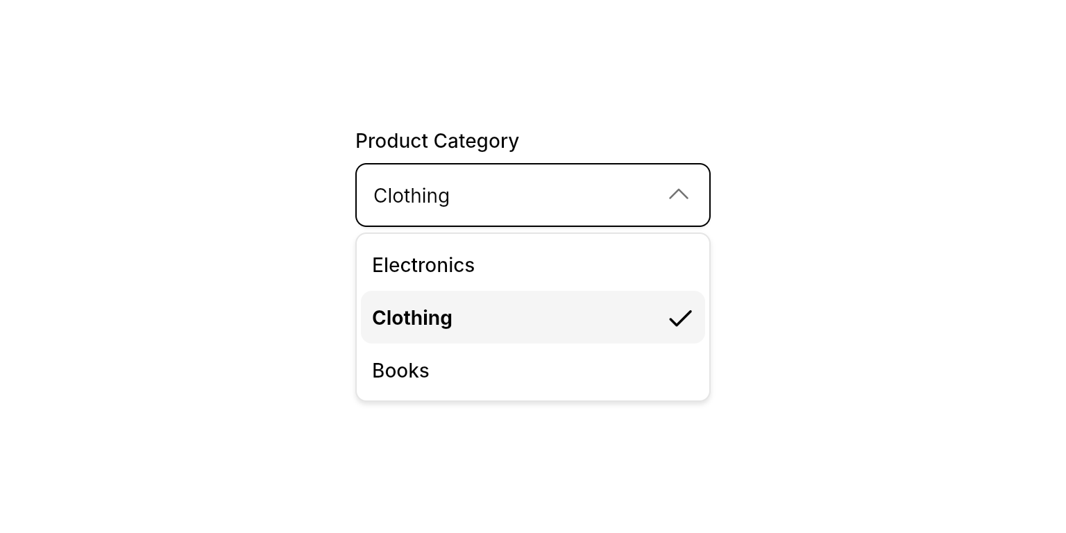
 ```dart Simple Dropdown lines theme={null}
NeoDropdownField(
label: "Product Category",
selected: "clothing",
sections: [
NeoDropdownFieldSection(
children: [
NeoDropdownFieldItem(
id: "electronics",
label: "Electronics",
),
NeoDropdownFieldItem(
id: "clothing",
label: "Clothing",
),
NeoDropdownFieldItem(
id: "books",
label: "Books",
),
],
),
],
onChanged: (value) {
// Handle selection change
},
),
```
```dart Simple Dropdown lines theme={null}
NeoDropdownField(
label: "Product Category",
selected: "clothing",
sections: [
NeoDropdownFieldSection(
children: [
NeoDropdownFieldItem(
id: "electronics",
label: "Electronics",
),
NeoDropdownFieldItem(
id: "clothing",
label: "Clothing",
),
NeoDropdownFieldItem(
id: "books",
label: "Books",
),
],
),
],
onChanged: (value) {
// Handle selection change
},
),
```

 ```dart With Icons lines theme={null}
NeoDropdownField(
label: "Payment Method",
selected: "solana",
sections: [
NeoDropdownFieldSection(
children: [
NeoDropdownFieldItem(
id: "solana",
label: "Solana",
description: "SOL",
isDescriptionInline: true,
icon: PhosphorIcons.coinVertical,
),
NeoDropdownFieldItem(
id: "bitcoin",
label: "Bitcoin",
description: "BTC",
isDescriptionInline: true,
icon: PhosphorIcons.currencyBtc,
),
NeoDropdownFieldItem(
id: "ethereum",
label: "Ethereum",
description: "ETH",
isDescriptionInline: true,
icon: PhosphorIcons.currencyEth,
),
],
),
],
onChanged: (value) {
// Handle selection change
},
),
```
```dart With Icons lines theme={null}
NeoDropdownField(
label: "Payment Method",
selected: "solana",
sections: [
NeoDropdownFieldSection(
children: [
NeoDropdownFieldItem(
id: "solana",
label: "Solana",
description: "SOL",
isDescriptionInline: true,
icon: PhosphorIcons.coinVertical,
),
NeoDropdownFieldItem(
id: "bitcoin",
label: "Bitcoin",
description: "BTC",
isDescriptionInline: true,
icon: PhosphorIcons.currencyBtc,
),
NeoDropdownFieldItem(
id: "ethereum",
label: "Ethereum",
description: "ETH",
isDescriptionInline: true,
icon: PhosphorIcons.currencyEth,
),
],
),
],
onChanged: (value) {
// Handle selection change
},
),
```

 ```dart Searchable Dropdown lines theme={null}
NeoDropdownField(
label: "Country",
placeholder: "Select your country",
selected: "netherlands",
isSearchable: true,
searchPlaceholder: "Search countries...",
sections: [
NeoDropdownFieldSection(
label: "Europe",
children: [
NeoDropdownFieldItem(
id: "germany",
label: "Germany",
),
NeoDropdownFieldItem(
id: "netherlands",
label: "The Netherlands",
),
NeoDropdownFieldItem(
id: "france",
label: "France",
),
],
),
NeoDropdownFieldSection(
label: "North America",
children: [
NeoDropdownFieldItem(
id: "usa",
label: "United States",
),
NeoDropdownFieldItem(
id: "canada",
label: "Canada",
),
],
),
],
onChanged: (value) {
// Handle selection change
},
),
```
```dart Searchable Dropdown lines theme={null}
NeoDropdownField(
label: "Country",
placeholder: "Select your country",
selected: "netherlands",
isSearchable: true,
searchPlaceholder: "Search countries...",
sections: [
NeoDropdownFieldSection(
label: "Europe",
children: [
NeoDropdownFieldItem(
id: "germany",
label: "Germany",
),
NeoDropdownFieldItem(
id: "netherlands",
label: "The Netherlands",
),
NeoDropdownFieldItem(
id: "france",
label: "France",
),
],
),
NeoDropdownFieldSection(
label: "North America",
children: [
NeoDropdownFieldItem(
id: "usa",
label: "United States",
),
NeoDropdownFieldItem(
id: "canada",
label: "Canada",
),
],
),
],
onChanged: (value) {
// Handle selection change
},
),
```

 ```dart With Descriptions lines theme={null}
NeoDropdownField(
label: "User Role",
selected: "admin",
sections: [
NeoDropdownFieldSection(
children: [
NeoDropdownFieldItem(
id: "admin",
label: "Administrator",
description: "Full access",
),
NeoDropdownFieldItem(
id: "editor",
label: "Editor",
description: "Can create and edit content",
),
NeoDropdownFieldItem(
id: "viewer",
label: "Viewer",
description: "Can only view content",
),
],
),
],
onChanged: (value) {
// Handle selection change
},
),
```
```dart With Descriptions lines theme={null}
NeoDropdownField(
label: "User Role",
selected: "admin",
sections: [
NeoDropdownFieldSection(
children: [
NeoDropdownFieldItem(
id: "admin",
label: "Administrator",
description: "Full access",
),
NeoDropdownFieldItem(
id: "editor",
label: "Editor",
description: "Can create and edit content",
),
NeoDropdownFieldItem(
id: "viewer",
label: "Viewer",
description: "Can only view content",
),
],
),
],
onChanged: (value) {
// Handle selection change
},
),
```

 ```dart Error State lines theme={null}
NeoDropdownField(
selected: null,
errorText: "This field is required",
sections: [
NeoDropdownFieldSection(
children: [
NeoDropdownFieldItem(id: "option1", label: "Option 1"),
NeoDropdownFieldItem(id: "option2", label: "Option 2"),
],
),
],
onChanged: (value) {
// Handle selection change
},
),
```
```dart Error State lines theme={null}
NeoDropdownField(
selected: null,
errorText: "This field is required",
sections: [
NeoDropdownFieldSection(
children: [
NeoDropdownFieldItem(id: "option1", label: "Option 1"),
NeoDropdownFieldItem(id: "option2", label: "Option 2"),
],
),
],
onChanged: (value) {
// Handle selection change
},
),
```

 ```dart Multi-Select lines theme={null}
final selectedCategories = useState?>({});
NeoDropdownField(
label: "Product Categories",
selected: selectedCategories.value,
allowDeselect: true,
sections: [
NeoDropdownFieldSection(
children: [
NeoDropdownFieldItem(
id: "electronics",
label: "Electronics",
),
NeoDropdownFieldItem(
id: "clothing",
label: "Clothing",
),
NeoDropdownFieldItem(
id: "books",
label: "Books",
),
],
),
],
onChanged: (value) {
selectedCategories.value = value;
},
),
```
## Properties
### Required
The currently selected value(s). For single-select, use `String?` (e.g., `selected: "item-id"` or `selected: null`). For multi-select, use `Set` (e.g., `selected: {"item1", "item2"}`). The generic type `T` determines the selection mode.
Callback function called when the selection changes. Receives the selected value(s) matching the generic type `T`. For single-select, receives `String?`. For multi-select, receives `Set`.
A list of sections containing the dropdown options. Each section groups related items together.
### Content
The label text displayed above the dropdown field.
The placeholder text shown when no item is selected.
### Layout
Whether the dropdown should have a fixed height or expand to fit content. When true, provides a scrollable area for long lists.
### Search
Whether to enable search functionality within the dropdown. When true, adds a sticky search field at the top of the dropdown.
The placeholder text for the search field. Only relevant when `isSearchable` is true.
When `isSearchable` is true, automatically focuses the search field when opening the dropdown.
Builder called when no items match the current search query. Receives the `BuildContext` and the current `searchQuery` string. Use this to show a "No results" message or a prompt to create a new item.
Called with the current search query when the user triggers inline item creation. Requires `isSearchable: true`. Pair with `createItemLabel` to control the creation prompt text.
Returns the label shown for the "create" option at the bottom of the list. Receives the current search query. Only shown when `onCreateItem` is provided and the query is non-empty.
### State
Whether users can deselect the currently selected item by clicking it again. When true, clicking the selected item calls `onChanged` with `null`.
Controls whether the dropdown is interactive. When `false`, the field dims, ignores input and focus, and shows a forbidden cursor.
### Validation
Error message to display below the dropdown field. When provided, the field shows an error state with red styling.
## Section Properties
`NeoDropdownFieldSection` is an `@immutable` data class. Do not pass a `key`.
### Required
A list of items within this section.
### Content
The section header text. When provided, the header is sticky — it stays pinned while scrolling through the section's items.
Whether to show a divider above this section.
## Item Properties
`NeoDropdownFieldItem` is an `@immutable` data class. Do not pass a `key`.
### Required
A unique identifier for the item. This value is passed to the `onChanged` callback when selected. Must be unique across all items.
The display text for the item.
### Content
Additional descriptive text displayed below the label for extra context.
An optional icon to display before the label.
Whether to display the description inline with the label instead of below it.
An optional widget rendered before the label (e.g. an avatar or color swatch).
An optional widget rendered after the label (e.g. a badge or action icon).
When `true`, the `suffix` widget is only visible while the item is hovered. Useful for revealing action controls without cluttering the list.
## Typedefs
### NeoDropdownEmptyStateBuilder
```dart theme={null}
typedef NeoDropdownEmptyStateBuilder =
Widget Function(BuildContext context, String searchQuery);
```
Signature for the `emptyStateBuilder` prop. Receives the current `searchQuery` so you can show a contextual message or a "Create X" prompt.
## Best Practices
* **Width Constraints**: Always provide width constraints to prevent layout issues by wrapping in `ConstrainedBox`, `SizedBox`, `Expanded`, etc.
* **Unique IDs**: Ensure all item IDs are unique across all sections to prevent errors
* **Error Handling**: Use `errorText` to provide clear validation feedback when e.g. the field is required
* **Deselection**: Enable `allowDeselect` for optional fields where "no selection" is a valid state. (E.g. filter fields)
* **Multi-Select**: Use `NeoDropdownField>` for multi-select scenarios. The dropdown stays open after selection, allowing multiple items to be selected.
## Integration Notes
* **Generic Type**: The widget is generic and supports two modes:
* Single-select: `NeoDropdownField` or `NeoDropdownField` (use nullable for optional fields)
* Multi-select: `NeoDropdownField>` (automatically enables multi-select behavior)
* **ID Validation**: The widget validates that all item IDs are unique and non-empty. Invalid IDs will trigger errors.
```dart Multi-Select lines theme={null}
final selectedCategories = useState?>({});
NeoDropdownField(
label: "Product Categories",
selected: selectedCategories.value,
allowDeselect: true,
sections: [
NeoDropdownFieldSection(
children: [
NeoDropdownFieldItem(
id: "electronics",
label: "Electronics",
),
NeoDropdownFieldItem(
id: "clothing",
label: "Clothing",
),
NeoDropdownFieldItem(
id: "books",
label: "Books",
),
],
),
],
onChanged: (value) {
selectedCategories.value = value;
},
),
```
## Properties
### Required
The currently selected value(s). For single-select, use `String?` (e.g., `selected: "item-id"` or `selected: null`). For multi-select, use `Set` (e.g., `selected: {"item1", "item2"}`). The generic type `T` determines the selection mode.
Callback function called when the selection changes. Receives the selected value(s) matching the generic type `T`. For single-select, receives `String?`. For multi-select, receives `Set`.
A list of sections containing the dropdown options. Each section groups related items together.
### Content
The label text displayed above the dropdown field.
The placeholder text shown when no item is selected.
### Layout
Whether the dropdown should have a fixed height or expand to fit content. When true, provides a scrollable area for long lists.
### Search
Whether to enable search functionality within the dropdown. When true, adds a sticky search field at the top of the dropdown.
The placeholder text for the search field. Only relevant when `isSearchable` is true.
When `isSearchable` is true, automatically focuses the search field when opening the dropdown.
Builder called when no items match the current search query. Receives the `BuildContext` and the current `searchQuery` string. Use this to show a "No results" message or a prompt to create a new item.
Called with the current search query when the user triggers inline item creation. Requires `isSearchable: true`. Pair with `createItemLabel` to control the creation prompt text.
Returns the label shown for the "create" option at the bottom of the list. Receives the current search query. Only shown when `onCreateItem` is provided and the query is non-empty.
### State
Whether users can deselect the currently selected item by clicking it again. When true, clicking the selected item calls `onChanged` with `null`.
Controls whether the dropdown is interactive. When `false`, the field dims, ignores input and focus, and shows a forbidden cursor.
### Validation
Error message to display below the dropdown field. When provided, the field shows an error state with red styling.
## Section Properties
`NeoDropdownFieldSection` is an `@immutable` data class. Do not pass a `key`.
### Required
A list of items within this section.
### Content
The section header text. When provided, the header is sticky — it stays pinned while scrolling through the section's items.
Whether to show a divider above this section.
## Item Properties
`NeoDropdownFieldItem` is an `@immutable` data class. Do not pass a `key`.
### Required
A unique identifier for the item. This value is passed to the `onChanged` callback when selected. Must be unique across all items.
The display text for the item.
### Content
Additional descriptive text displayed below the label for extra context.
An optional icon to display before the label.
Whether to display the description inline with the label instead of below it.
An optional widget rendered before the label (e.g. an avatar or color swatch).
An optional widget rendered after the label (e.g. a badge or action icon).
When `true`, the `suffix` widget is only visible while the item is hovered. Useful for revealing action controls without cluttering the list.
## Typedefs
### NeoDropdownEmptyStateBuilder
```dart theme={null}
typedef NeoDropdownEmptyStateBuilder =
Widget Function(BuildContext context, String searchQuery);
```
Signature for the `emptyStateBuilder` prop. Receives the current `searchQuery` so you can show a contextual message or a "Create X" prompt.
## Best Practices
* **Width Constraints**: Always provide width constraints to prevent layout issues by wrapping in `ConstrainedBox`, `SizedBox`, `Expanded`, etc.
* **Unique IDs**: Ensure all item IDs are unique across all sections to prevent errors
* **Error Handling**: Use `errorText` to provide clear validation feedback when e.g. the field is required
* **Deselection**: Enable `allowDeselect` for optional fields where "no selection" is a valid state. (E.g. filter fields)
* **Multi-Select**: Use `NeoDropdownField>` for multi-select scenarios. The dropdown stays open after selection, allowing multiple items to be selected.
## Integration Notes
* **Generic Type**: The widget is generic and supports two modes:
* Single-select: `NeoDropdownField` or `NeoDropdownField` (use nullable for optional fields)
* Multi-select: `NeoDropdownField>` (automatically enables multi-select behavior)
* **ID Validation**: The widget validates that all item IDs are unique and non-empty. Invalid IDs will trigger errors.