> ## Documentation Index
> Fetch the complete documentation index at: https://neo.tvk.company/llms.txt
> Use this file to discover all available pages before exploring further.
# Card
> A clean container widget with subtle shadows and borders, perfect for grouping related content and creating visual hierarchy.
## Example
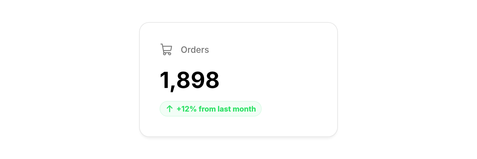
 ```dart Dashboard Stats Card lines focus={1-2, 40} theme={null}
NeoCard(
child: Column(
crossAxisAlignment: .start,
mainAxisSize: .min,
children: [
Row(
mainAxisSize: .min,
children: [
PhosphorIcon(
PhosphorIconsRegular.shoppingCart,
color: theme.colors.fgSecondary,
size: 22,
),
Gap(theme.spacings.small),
Text(
"Orders",
style: theme.textStyles.label.copyWith(
color: theme.colors.fgSecondary,
),
),
],
),
Gap(theme.spacings.medium),
Text(
"1,898",
style: theme.textStyles.header1.copyWith(
color: theme.colors.fgPrimary,
fontSize: 36,
),
),
Gap(theme.spacings.small),
NeoBadge(
label: "+12% from last month",
icon: PhosphorIcons.arrowUp,
color: theme.colors.success,
isPill: true,
),
],
),
),
```
## Properties
### Required
The content to display inside the card.
### Layout
Custom padding inside the card.
## Best Practices
* **Group related content**: Use cards to visually group related information and create clear content boundaries
* **Use consistent padding**: Stick with default padding or use theme spacing values for consistency
* **Consider content hierarchy**: Use appropriate text styles and spacing within cards
* **Avoid nesting cards**: Generally avoid placing cards inside other cards to prevent visual complexity
## Integration Notes
* **Flexible content**: Works with any widget as child content
```dart Dashboard Stats Card lines focus={1-2, 40} theme={null}
NeoCard(
child: Column(
crossAxisAlignment: .start,
mainAxisSize: .min,
children: [
Row(
mainAxisSize: .min,
children: [
PhosphorIcon(
PhosphorIconsRegular.shoppingCart,
color: theme.colors.fgSecondary,
size: 22,
),
Gap(theme.spacings.small),
Text(
"Orders",
style: theme.textStyles.label.copyWith(
color: theme.colors.fgSecondary,
),
),
],
),
Gap(theme.spacings.medium),
Text(
"1,898",
style: theme.textStyles.header1.copyWith(
color: theme.colors.fgPrimary,
fontSize: 36,
),
),
Gap(theme.spacings.small),
NeoBadge(
label: "+12% from last month",
icon: PhosphorIcons.arrowUp,
color: theme.colors.success,
isPill: true,
),
],
),
),
```
## Properties
### Required
The content to display inside the card.
### Layout
Custom padding inside the card.
## Best Practices
* **Group related content**: Use cards to visually group related information and create clear content boundaries
* **Use consistent padding**: Stick with default padding or use theme spacing values for consistency
* **Consider content hierarchy**: Use appropriate text styles and spacing within cards
* **Avoid nesting cards**: Generally avoid placing cards inside other cards to prevent visual complexity
## Integration Notes
* **Flexible content**: Works with any widget as child content