

Examples
- Basic
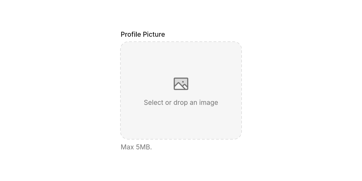
- With Label & Description
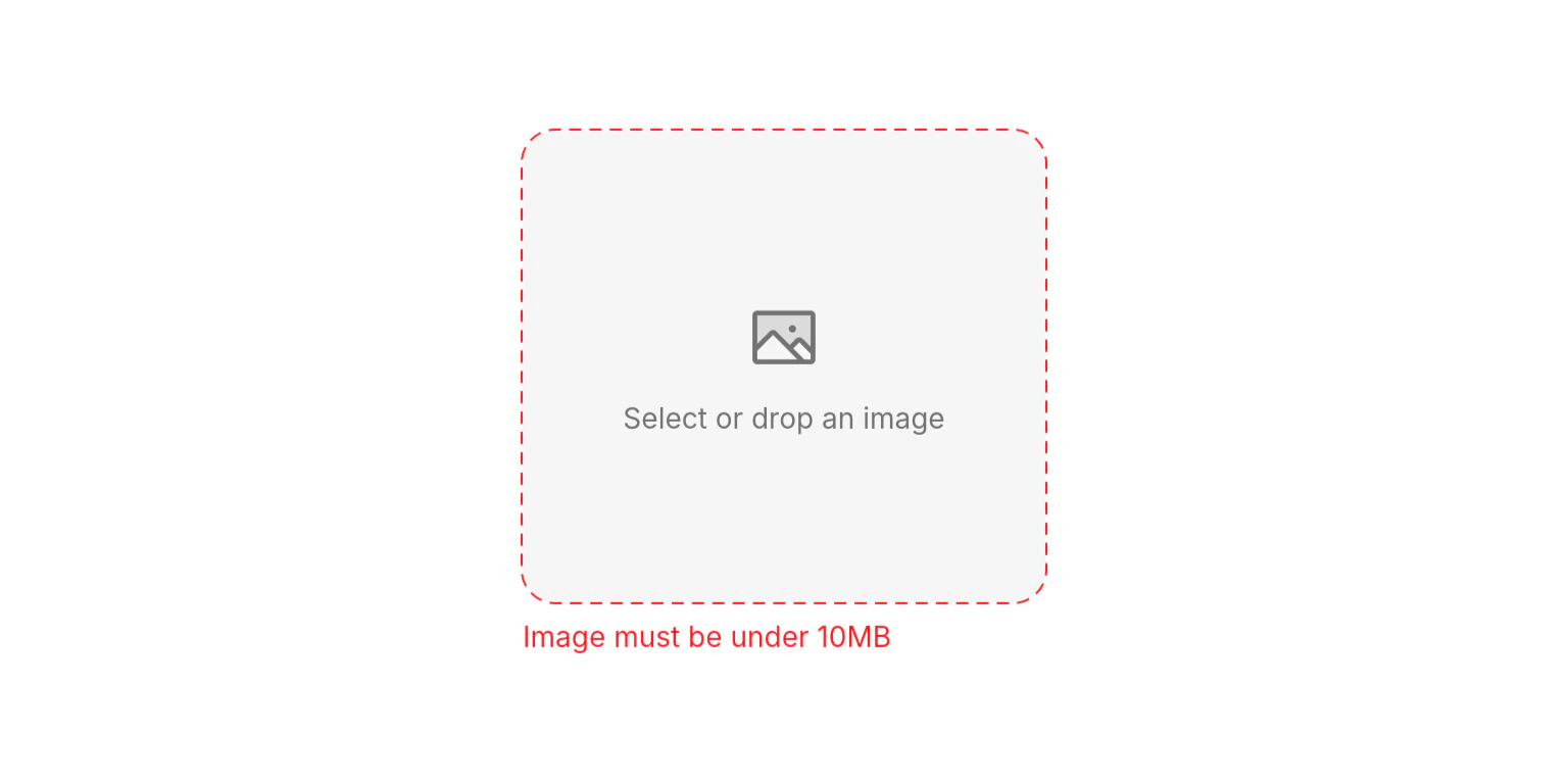
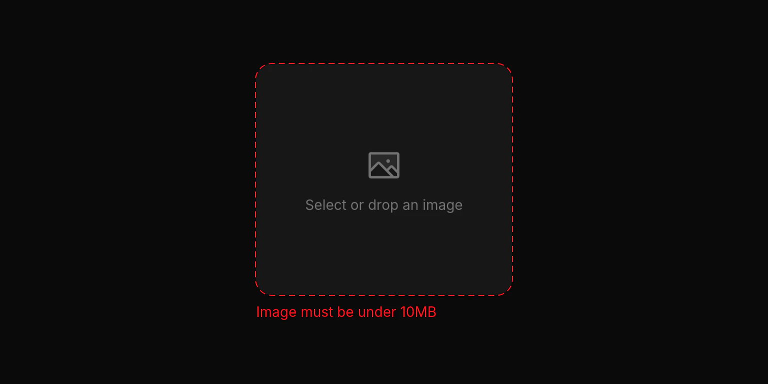
- Custom Error Handling
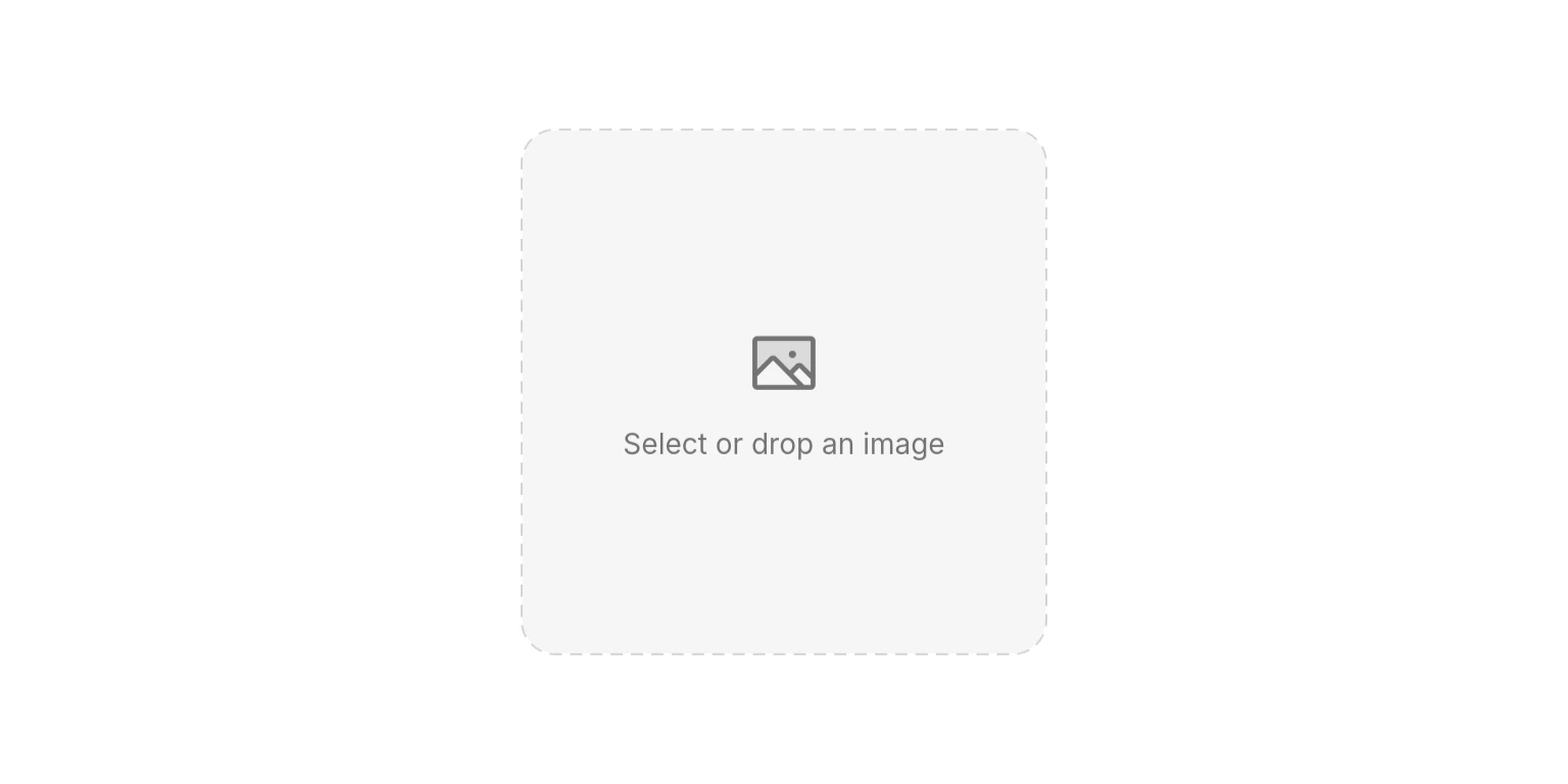
Empty state of the image picker.
Properties
Required
ValueChanged<Uint8List?>
required
Called when an image is selected, dropped, or cleared. Receives the raw image bytes, or
null when the image is removed.Content
Uint8List?
The currently displayed image as raw bytes. When provided, the image is rendered inside the picker with a swap overlay on hover and an optional clear button.
String?
A label displayed above the picker area.
String?
Helper text displayed below the picker area.
String?
External error text displayed below the picker. Overrides any internal error messages.
String?
default:"Select or drop an image"
Custom placeholder text shown when no image is selected.
String? Function(NeoImagePickerError)?
Custom error message resolver. Return a string to override the default message for a specific error, or
null to use the default.Layout
double?
Explicit width for the drop zone. When null, the drop zone expands to the available width.
double?
default:"240"
Explicit height for the drop zone. Defaults to 240 when unconstrained.
int
default:"104857600 (100MB)"
Maximum allowed file size in bytes. Files exceeding this limit trigger a
fileTooLarge error.bool
default:"true"
Whether to show a clear button in the top-right corner when an image is displayed.
State
bool
default:"true"
Controls whether the picker responds to taps and drag-and-drop. Disabled pickers show reduced opacity and a forbidden cursor.
Enums
NeoImagePickerError
Error types that can occur during image selection or processing.fileTooLarge: The selected file exceedsmaxFileSize.unsupportedFormat: The dropped file is not a supported image format.pickFailed: The file picker failed to open or return a result.readFailed: The file could not be read from disk.dropFailed: The drag-and-drop operation failed.renderFailed: The image bytes could not be rendered (invalid format).unknown: An unexpected error occurred.
Best Practices
- Set a reasonable
maxFileSize: The default 100MB limit is generous. For profile pictures or thumbnails, set a lower limit (e.g.,5 * 1024 * 1024for 5MB) or compress on the server side. - Provide custom error messages with
onError: Tailor error messages to your use case or language for a better user experience. - Size the drop zone: Prefer
dropZoneWidth/dropZoneHeightover wrapping inSizedBoxwhen you need a fixed picker size. Unconstrained height defaults to 240.
Integration Notes
- Supported formats: PNG, JPEG, GIF, WebP, HEIC, HEIF, BMP, and TIFF.
- Loading state: The picker automatically shows a loading overlay while processing files or drag-and-drop operations.
- Image display: Selected images are displayed with
BoxFit.contain. On hover, a swap icon overlay appears to indicate the image can be replaced. - Drag-over highlight: While dragging a supported image over the drop zone, the border uses the theme
successcolor.