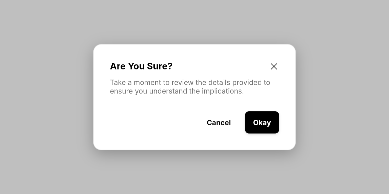
Different from other Neo widgets: Modal is used as a method call (
NeoModal.show()) rather than a widget you place in your build tree. Use it for important interactions that require user attention—confirmations, forms, or critical information that must be acknowledged.Examples
- Basic Modal
- Form Modal
- Non-Dismissable Modal


Methods
NeoModal.show()
Displays a modal overlay with customizable content and actions.Required Parameters
The widget reference from a
ConsumerWidget or HookConsumerWidget, used to access the modal provider.The title text displayed at the top of the modal.
A builder function that returns the main content of the modal. Use this to create forms, display information, or any custom content.
A builder function that returns a list of action buttons displayed at the bottom of the modal. Typically contains confirm/cancel buttons.
Optional Parameters
Whether users can dismiss the modal by clicking the background or close button. Set to
false for critical modals that require explicit user action.The size of the modal. Controls the maximum width.
NeoModal.dismissAll()
Dismisses all currently visible modals.The widget reference to access the modal provider.
NeoModal.dismissCount()
Dismisses a specific number of modals from the top of the stack.The widget reference to access the modal provider.
The number of modals to dismiss from the stack.
Enums
NeoModalSize
Controls the maximum width of the modal.small(400px): Best for most use cases, simple confirmations and brief messages.medium(640px): Ideal for forms and moderate content.large(896px): Perfect for extensive content, detailed forms, or comprehensive information.extraLarge(1536px): For wide content like tables, dashboards, or side-by-side comparisons.
Best Practices
- Dangerous Actions: Use
isDanger: trueon buttons for destructive actions like deletion
Integration Notes
- Backdrop Blur: Modals automatically blur the background content to focus user attention
- Responsive Design: Modals automatically adapt to different screen sizes with appropriate padding and constraints
- Stack Management: Multiple modals stack on top of each other; use
dismissCount()to dismiss specific numbers of modals