Different from other Neo widgets: Toast is used as a method call (
NeoToast.show()) rather than a widget you place in your build tree. Call it inside callbacks—after button presses, successful API calls, or when operations complete—to provide instant user feedback.Examples
- Toast Types
- With Description
- Update Toast


Methods
NeoToast.show()
Displays a toast notification at the bottom right of the screen. Returns a string ID that can be used to update the toast later.Required Parameters
The widget reference from a
ConsumerWidget or HookConsumerWidget, used to access the toast provider.The main text message to display in the toast.
The preset type that determines styling, icon, and behavior. Use presets for consistent UX.
Optional Parameters
Additional text displayed below the main label for extra context.
Custom icon to override the preset icon from
type.Custom color to override the preset color from
type.Custom auto-dismiss behavior to override the preset from
type.Whether the icon should rotate continuously (e.g. for custom loading states).
Whether to show a dismiss button. If null, determined by
autoDismiss setting.NeoToast.update()
Updates an existing toast with new content. Perfect for progress feedback or changing toast context.Required Parameters
The widget reference to access the toast provider.
The ID returned from
NeoToast.show() to identify which toast to update.Optional Parameters
New preset type to apply. Updates styling, icon, and behavior.
New main text message.
New description text.
New custom icon.
New custom color.
New auto-dismiss behavior.
New icon rotation state.
New dismiss button visibility.
Enums
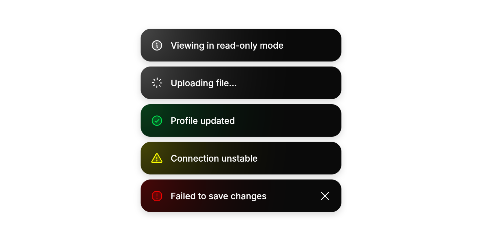
NeoToastType
Predefined toast configurations that automatically handle styling and behavior.info: General informationloading: Ongoing operations with spinnersuccess: Successful actions with checkmark iconwarning: Cautionary messages with warning icondanger: Error states with error icon
Best Practices
- Use Presets: Leverage
NeoToastTypepresets for consistent user experience and automatic behavior - Progress Updates: Use
NeoToast.update()for operations that transition between states (loading → success/error) - Appropriate Duration: Trust preset auto-dismiss behavior—success/info toasts dismiss automatically, errors state require user action, loading state stays until type is changed or programatically dismissed
- Description Usage: Use
descriptionfor helpful details like file paths, error codes, or next steps - Enhanced Feedback: Combine with
NeoHapticsfor error toasts to provide tactile feedback alongside visual notifications
Integration Notes
- Advanced Stacking: Multiple toasts stack vertically with dynamic height calculation and smooth repositioning animations
- Bounce Animation: Toasts briefly scale up when updated, providing visual feedback for content changes, grabbing user’s attention
- Swipe-to-Dismiss: When a toast has
autoDismissenabled or a dismiss control visible, users can drag it horizontally to dismiss. Dragging past ~25% of the toast width triggers dismissal with a light haptic. Releasing short of the threshold springs the toast back to its resting position.