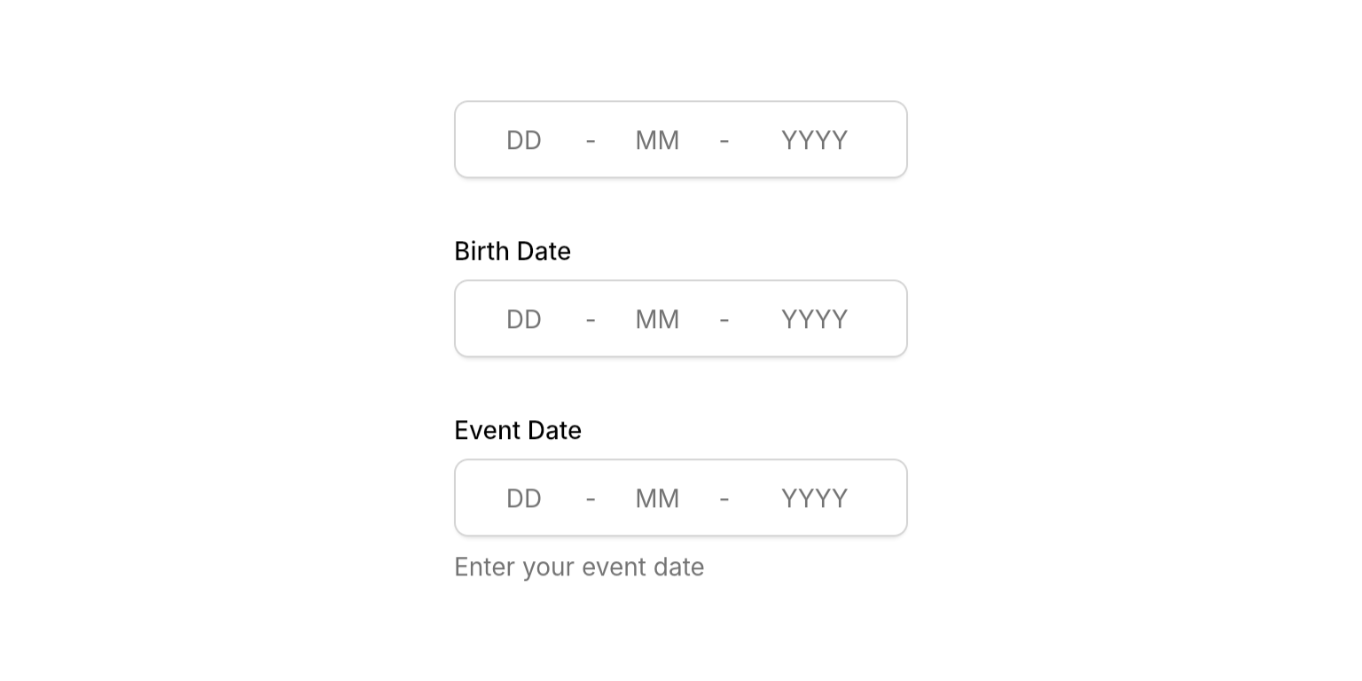
Examples
- Basic Usage
- With Validation
- States


Properties
Required
The current date string value in DD-MM-YYYY format. Can be partial during input but should be complete for display. Use
null or empty string to clear the field.Callback triggered when user completes editing (all segments filled or Enter pressed). Receives the normalized date string in DD-MM-YYYY format, or
null when the field is cleared or contains invalid input.Content
Optional label text displayed above the date field.
Optional helper text displayed below the field. Hidden when
errorText is present.State
Error message displayed below the field. When present, shows error state with danger-colored border and replaces the description text.
Controls whether the field accepts input and focus. When disabled, the field appears dimmed and prevents all interaction.
Focus node for managing focus state programmatically. When not provided, the widget creates its own internal focus node.
Callback function called when the field loses focus. Useful for explicit blur event handling.
Whether to show a clear button (x) that allows users to quickly clear the date field content.
Input Behavior
Value Clamping
- Typing: Days clamped to 1-31, months to 1-12, years to 1-9999 regardless of context
- Arrow keys: Context-aware clamping (e.g., day respects actual month/year if entered)
- Why different?: Safety in high-stake applications - typing “31-02” shows the invalid state instead of silently auto-correcting
Auto-Advance
- Day: Advances when typing ≥ 4 (e.g., “4” becomes “04” and advances)
- Month: Advances when typing ≥ 2 (e.g., “2” becomes “02” and advances)
- Year: Submits when 4 digits entered
Navigation
- Arrow keys: Move between segments or increment/decrement values
- Tab: Standard focus navigation
- Click: Jump to any segment and select all content
Best Practices
- Validation: Use
NeoDateValidatorinonSubmittedfor comprehensive validation - Width constraints: Wrap in
SizedBox,Expanded, orConstrainedBoxto prevent layout issues - Error handling: Clear
errorTextand updatedateStringinonSubmittedfor smooth UX
Integration Notes
- Submission-based: Calls
onSubmittedwhen complete (all segments filled, Enter pressed, or focus lost)