Examples
- Basic Usage
- States


Properties
Required
Callback triggered when user completes editing (all segments filled or Enter pressed). Receives a
TimeOfDay object with validated hour and minute values, or null when the field is cleared or contains invalid input.Content
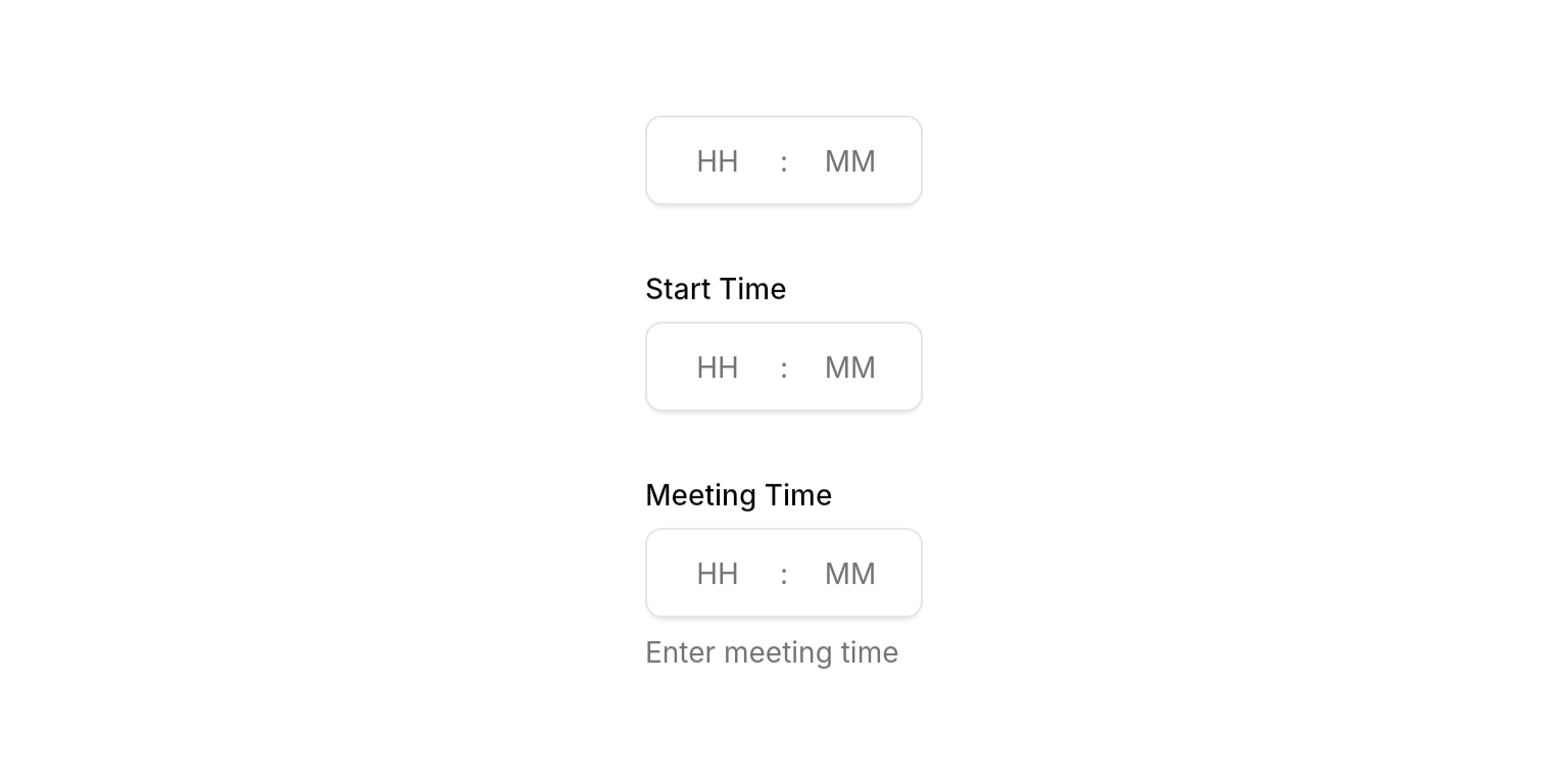
Optional label text displayed above the time field.
Optional helper text displayed below the field. Hidden when
errorText is present.State
Error message displayed below the field. When present, shows error state with danger-colored border and replaces the description text.
Controls whether the field accepts input and focus. When disabled, the field appears dimmed and prevents all interaction.
The current time value. Use
null to clear the field. The field will display the time in HH:MM format.Focus node for managing focus state programmatically. When not provided, the widget creates its own internal focus node.
Callback function called when the field loses focus. Useful for explicit blur event handling.
Whether to show a clear button (x) that allows users to quickly clear the time field content.
Input Behavior
Value Clamping
- Typing: Hours clamped to 0-23, minutes to 0-59
- Arrow keys: Context-aware clamping with the same ranges
- Validation: Automatic normalization ensures valid time values
Auto-Advance
- Hour: Advances when typing ≥ 3 (e.g., “3” becomes “03” and advances)
- Minute: Submits when 2 digits entered and hour is filled
Navigation
- Arrow keys: Move between segments or increment/decrement values (↑/↓ by 1, ←/→ between segments)
- Tab: Standard focus navigation with Shift+Tab for reverse
- Click: Jump to any segment and select all content
- Enter: Submit the current time value
Best Practices
- Width constraints: Wrap in
SizedBox,Expanded, orConstrainedBoxto prevent layout issues - Time validation: Implement custom validation in
onSubmittedfor business rules (e.g., business hours, appointment slots) - Error handling: Clear
errorTextand updatetimeinonSubmittedfor smooth UX
Integration Notes
- Automatic normalization: Invalid times are automatically corrected to valid ranges (e.g., 25:00 becomes 23:00)