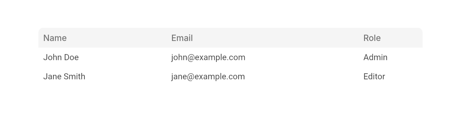
Examples
- Basic Usage
- With Sorting
- With Selection
- Row Reordering
- Border and Dividers


Properties
Required
The column definitions that determine the table’s structure and headers.
The data rows to display. Each row’s
cells map must include a widget for every visible column ID.Content
Called when a row is tapped. Receives the row ID.
Called when a row’s hover state changes. Receives the row ID and hover status.
The ID of the currently active row. The active row receives distinct highlight styling.
Widget to display when
rows is empty. Falls back to an empty table body if not provided.Layout
Fixed height for all rows in logical pixels.
Height of the sticky column-header row in logical pixels.
Whether to show a border around the entire table.
Whether to show horizontal divider lines between rows.
Whether to show vertical divider lines between columns.
Scroll controller for the table body. Required when using
NeoTable.scrollToRow. An internal controller is used when not provided.Set of column IDs to hide. The columns remain in
columns so their cells are still defined in rows — they are simply not rendered.Sorting
The current sort state (column ID + direction).
null means unsorted.The sort state to fall back to when no explicit
sortState is set. The default-sort column cannot be fully unsorted — it cycles between ascending and descending.Called when the user clicks a sortable column header. Receives the new
NeoTableSortState, or null when returning to the unsorted state.Selection
Whether rows can be selected with checkboxes. When
true, onSelectionChanged must be provided.The currently selected row IDs.
Called when the selection changes. Required when
isSelectable is true.Reordering
Whether rows can be reordered by dragging. When
true, onRowReorder must be provided.Called when the user drops a row into a new position. Required when
isRowReorderable is true.Whether columns can be reordered by dragging their headers. When
true, onColumnReorder must be provided.Called when the user drops a column header into a new position. Required when
isColumnReorderable is true.State
Displays a loading indicator over the table body and disables interaction.
Static Helpers
NeoTable.scrollToRow()
Animates the table body scroll so the given row is aligned to the top of the viewport (below the fixed header).The same
ScrollController passed to the table’s scrollController prop.The current row list — must match the table’s
rows prop.The ID of the row to scroll to.
Must match the table’s
fixedRowHeight prop.Must match the table’s
showRowDividers prop so the scroll offset accounts for divider height.Column Properties
Required
A unique identifier for the column.
The display text for the column header.
Layout
Relative width of the column. Higher values take proportionally more space.
Minimum width in logical pixels. The column will not shrink below this value regardless of flex.
Sorting
Whether clicking this column’s header triggers
NeoTable.onSortChanged.Reordering / Visibility
Whether this column can be dragged when
NeoTable.isColumnReorderable is true.Whether this column can be included in
NeoTable.hiddenColumnIds.Row Properties
Required
A unique identifier for the row.
A map from column ID to the cell widget. Every visible column must have a corresponding entry.
Enums
NeoTableSortDirection
Sort direction for a column. The absence of a sort state (i.e.null on the table) represents the unsorted state — there is no none value.
ascending: Sort from lowest to highest.descending: Sort from highest to lowest.
Best Practices
- Cell map keys: Use the exact column
idstrings ascellsmap keys. The table asserts in debug mode if any visible column’s ID is missing from a row’s cells. - Width constraints: Always provide a bounded width constraint (via
Expanded,SizedBox, etc.) so the table’s flex layout has a finite extent to divide. - Scroll to row: Pass a
scrollControllerwhenever you plan to callNeoTable.scrollToRow. - Reordering and sorting: Enabling both
isRowReorderableand a livesortStateat the same time can produce confusing UX — the reordered position conflicts with the sorted order. Consider disabling sorting while reordering is active.
Integration Notes
- The table validates that all row IDs are unique and that every visible column has a matching cell in each row, both via debug-mode assertions.
- Sort cycling for a sortable column: descending → ascending →
null(unsorted). When adefaultSortStateis set for the column, the cycle is descending → ascending only.